
The Quiet Power of Colour: Designing with Intention at Edge of the Meadow
As the designer and founder of Edge of the Meadow, I believe that a home should not only reflect personal style, it should also support wellbeing. Our spaces are where we rest, create, gather, and grow. They deserve thoughtful attention, not just in form and function, but in feeling.
In my studio, surrounded by sketches, swatches, and evolving mood boards, I find myself drawn again and again to colour and its ability to transform a room, to soothe or energise, to root us or lift us. Colour shapes our spaces in ways we often feel before we even notice.
A Mood Board Rooted in Wellness and Nature
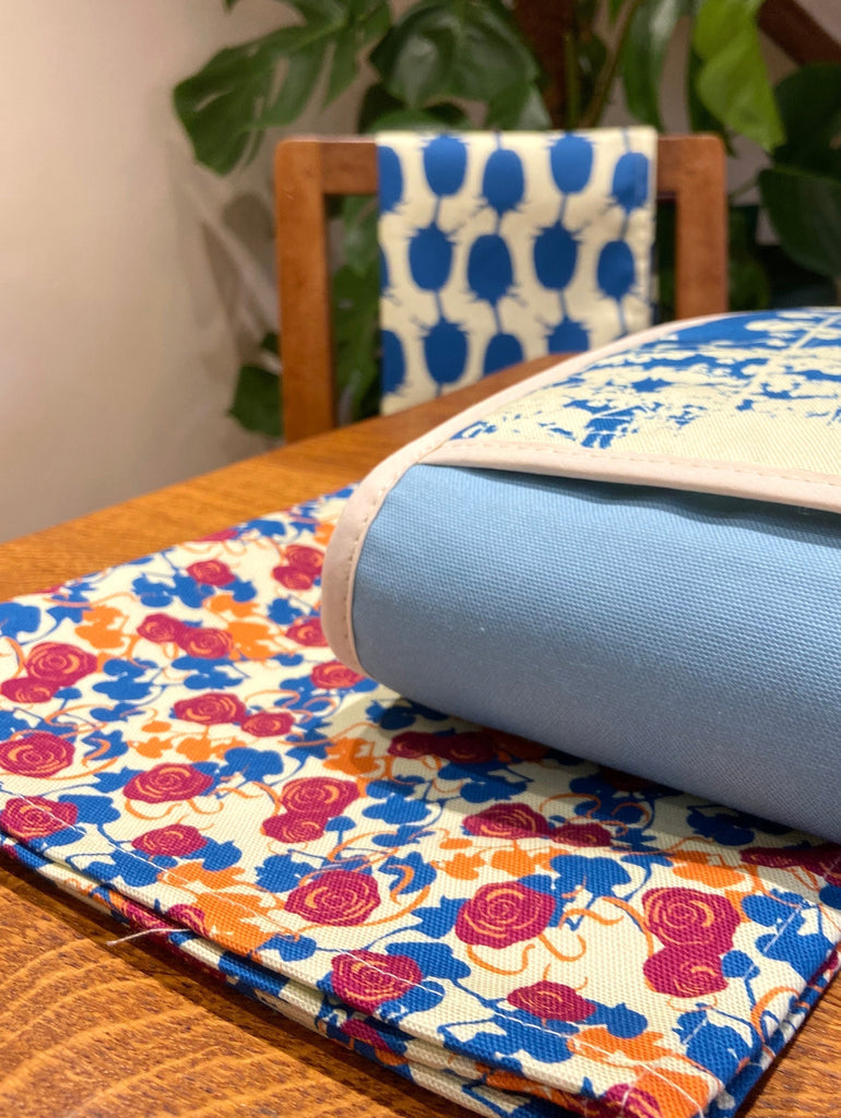
This mood board was created to explore a subtle but rich colour story. It balances grounded earth tones, warm neutrals, gentle browns, with uplifting accents of lilac and mustard yellow. These shades are inspired by the quiet beauty of kitchens and gardens, places where we nurture ourselves and those we love.

By combining calm, natural neutrals with more vibrant highlights, the palette evokes both stillness and vitality, a reflection of the layered rhythms of home life. It’s a reminder that we can embrace energy and ease in the same space.
Understanding Colour Trends in Home Décor
While my design approach is rooted in timelessness, I remain mindful of the broader colour trends influencing interiors. One such influence is the Pantone Colour of the Year a global selection that often captures the emotional undercurrent of the moment.
These colours don’t just appear in fashion runways or marketing campaigns. They quietly shape the world around us, surfacing in product design, packaging, and interiors. You may have noticed seasons tinted with soft sage greens, the return of terracotta, or a renewed love for dusty blues.
These aren't just passing fads. They're emotional cues, shifts in what we collectively need or desire.
As an independent designer, I don’t chase trends. But I do value staying connected to the design landscape. It’s not about following, it’s about listening and interpreting, so the work I create feels relevant yet enduring.
Perennial Pop: A Joyful Take on Retro Colour
One of the most popular palettes to emerge from my studio is Perennial Pop. It is playful, retro, and endlessly optimistic.
Designed for those who love adding small, vibrant bursts of colour to their home, it includes sunny lemon, soft pink, leafy green, and a splash of turquoise. These tones feel nostalgic yet fresh, rooted in mid-century floral charm, but elevated for today’s interiors.
Each colour is chosen not just for its beauty, but for how it makes a space feel joyful, and full of character.

Balancing Trend with Timelessness
At Edge of the Meadow, I don’t design to chase trends, I design with awareness. My goal is to create collections that last and evolve, rather than fade out when the next colour story arrives.
As a small batch producer, I have the freedom to make decisions slowly and with care. Every fabric, every thread, and every colour is selected with purpose.
This means each piece, whether a linen cushion, a seasonal runner, or a textile wall hanging can subtly refresh a room, without needing a total redesign. It's a quiet update that still makes an impact.
Small Updates, Lasting Impact
Home décor, like life, is always shifting. Fabrics wear in. Colours mellow. Our own needs change with the seasons. That’s why I believe in updating our homes intentionally, with well-made, meaningful pieces.
Whether it’s a new tone for spring, a vibrant kitchen runner, or a replacement for a beloved cushion, these small shifts can completely change the mood of a room.
This is design as an act of care both for your space and for yourself.

The Emotional Role of Colour
Colour does more than decorate, it evokes. Some tones ground and soothe us. Others uplift and inspire. In the home, these subtleties shape our day to day experiences.
This is why mood boards are such powerful tools. Whether consciously curated or intuitively assembled, they help us translate feeling into form.
At Edge of the Meadow, I select colour with intention, sometimes soft and subdued, other times bold and expressive. My goal is always the same: to support the mood of a space and the people within it.
I work with palettes that express calm sanctuary or joyful energy. I choose materials that feel good, and tones that speak to the soul of a room.
Thank you for joining me in this exploration of colour and emotion in design. If this resonates with you, I invite you to explore the latest pieces and seasonal palettes from Edge of the Meadow. Use colour intentionally to shape a home that reflects how you want to live and feel.
Leave a comment